InstallShield lets you define and customize various UI-related styles to easily change the look and feel of the Suite wizard interface without requiring you to manually edit each UI element individually. Using styles helps to ensure that the Suite wizard interface is formatted consistently throughout the installation.
This article explains how to use the styles in a Suite project to customize the UI. It also contains some background image files that you can download and use in your Suite projects.
Benefits of the Suite UI
The Suite engine (which displays the run-time UI during Suite installations) offers several run-time UI-related advantages over the Windows Installer engine (which displays the run-time UI during Basic MSI installations). Some examples are:
- The Suite UI has native support for using gradients for UI elements. To use gradients in the Windows Installer UI, you would need to use image files that already use a gradient.
- The Suite UI lets you define images as backgrounds and use them behind different controls. With the Windows Installer UI, if you use a check box over a custom background image, the check box’s label uses the standard solid Windows Installer background color; it does not use the custom background image.
- Suite installations let you use hyperlink controls and command-link controls on Window XP and later systems. For the Windows Installer UI, hyperlinks require Windows Installer 5, and command-link controls are not supported. (The sample screen shots in this blog article show an example of command-link controls.)
Suite UI Basics
The wizard interface of a Suite installation consists of wizard pages and secondary windows (also known as pop-up windows). The following two screen shots show the basic elements of the UI.
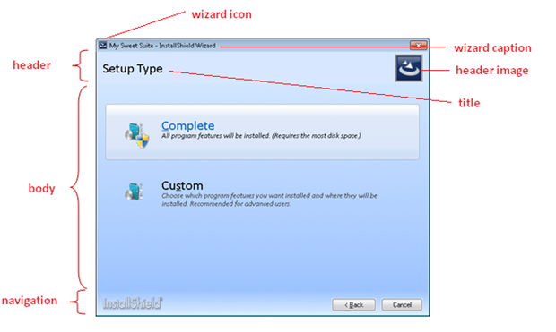
Sample wizard page in a Suite project
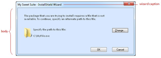
Sample secondary window in a Suite project
InstallShield lets you use your own wizard icon, header image, and wizard caption. InstallShield also lets you define and customize styles for the header, body, and navigation areas of the Suite UI.
Suite Style Basics
InstallShield contains a number of built-in text styles that define text attributes such as color, size, and font name for the text on the wizard UI. InstallShield also contains several built-in brush styles. A brush style specifies a solid color, a gradient, or an image for various elements of the wizard interface, such as the background of wizard pages and controls. You can edit any of the settings for these built-in styles, or define your own styles, through the Wizard Interface view in your Suite project.
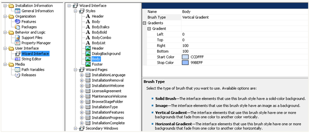
Settings for the built-in Body brush style
The Wizard Pages node in the Wizard Interface view lets you select default project-wide text styles and brush styles; this view also lets you override the default values for the wizard caption, wizard icon, and header image.

Project-wide wizard UI settings
Use page-specific and control-specific settings such as the Body Background setting that is available for specific wizard pages, secondary windows, and wizard controls if you want to override a specific use of a style. For example, the Body Background setting for the InstallationWelcome wizard page lets you override the project’s default background on just the InstallationWelcome wizard page.
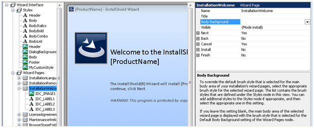
Body Background setting for a wizard page. Selecting a value in this setting overrides the default value that is selected for the Wizard Pages node.
Using Only One Background for the Header, Body, and Navigation Areas
By default, InstallShield enables you to use different brush styles for the header, body, and navigation areas of your wizard pages. In some cases, though, you may want to use only one brush style (for example, a single background image) across all three of those areas. Although at this time InstallShield does not have a setting that lets you switch to a single background brush, you can edit the project file (.issuite) in a text editor to get this effect.
To switch from three separate brush styles to a single brush style for all of the wizard pages in your Suite project:
- In the Wizard Interface view, select the brush style that you want to use as the background for all of your wizard pages and secondary windows. InstallShield displays its settings in the right pane.
- In the Brush Type setting, select Image.
- In the Resource image, click the ellipsis button (…), and then select the image that you want to use as the background.
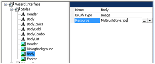
- Save and close your project.
- Save a backup copy of your .issuite project file.
- Open the .issuite file in a text editor.
-
Find the Wizard element in the XML code. Although it varies, depending on how you have the settings on the Wizard Pages node configured, it should look something like this:
<Wizard Format=”Aero” Caption=”IDS_PRODUCTNAME_INSTALLSHIELD” Icon=”IS.ico” Resize=”0″ Header.Background=”Header” Header.Class=”Header” Header.Image=”ISLogoSmall.png” View.Margin=”false” View.Height=”225″ View.Width=”400″ View.Background=”Body” View.Transition=”true” Navigation.Spacing=”group” Navigation.Direction=”RTL” Navigation.Background=”Footer” Navigation.Margin.cx=”10″>
- Remove the Header.Background, View.Background, and Navigation.Background attributes, as well as their values. In the above example, these attributes and values are in bold.
-
Add a new Background attribute and value; the value should be the name of the brush style that you configured in step 3.
<Wizard Format=”Aero” Caption=”IDS_PRODUCTNAME_INSTALLSHIELD” Icon=”IS.ico” Resize=”0″ Header.Class=”Header” Header.Image=”ISLogoSmall.png” View.Margin=”false” View.Height=”225″ View.Width=”400″ Background=”Body” View.Transition=”true” Navigation.Spacing=”group” Navigation.Direction=”RTL” Navigation.Margin.cx=”10″>
Depending on what color background you use, you may need to modify the text styles to use a different color for the text so that it offers enough contrast with the background.
The next time that you build a release of your Suite project, InstallShield uses the background image that you configured for all of your wizard pages and secondary windows.
Sample Backgrounds
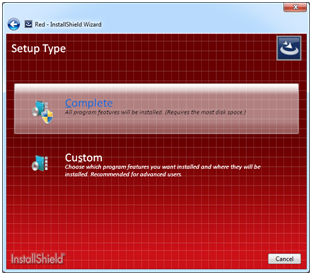
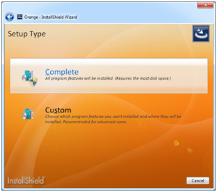
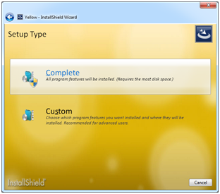
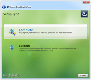
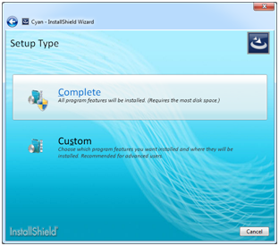
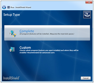
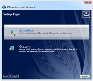
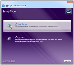
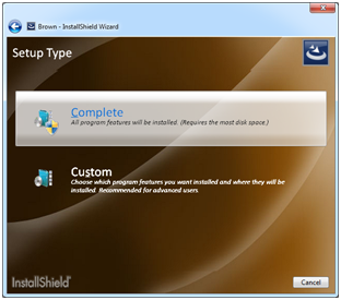
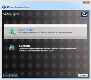
Revenera developed some images that you can download and use in your Suite projects as needed. Following are thumbnail samples of Suite wizard pages that use each of the sample images. To download a background image (.jpg) for use in your own projects, click its thumbnail image.
Which background is your favorite? Do you plan on defining your own custom backgrounds for use in your Suite UI?


